The journey to build a
Design system at GuideSpark
When Google released Material design back in Google I/O 14, I was very intrigued by the idea of having a design language that can help a product scale, keep the design consistent from both visual and behavioral aspects. Since then, I started to grow interest in design systems.
When I joined GuideSpark in late 2016, the company had changed its positioning to software. We had a small design team, and we had a long list of features that we wanted to pump into our product. The design for the product matured with time. However, the fast-growing rate of developing features left many inconsistencies in GSCC.
To help with this issue, I suggested establishing a design system in GuideSpark that includes components and provide guidelines. However, the journey was not simple, nor easy.
Type
Case study
Time
Fall, 2018 - Present
Tools
Figma, HTML & CSS
The problem
After a couple of years of fast-growing, GuideSpark Communicate Cloud shined with features. However, design and dev debts had accumulated that causing problems casting shadows on our product.
Inconsistency
Consistent design patterns help users to learn how to use a product easier, better predict the behaviors and overall better usability. It can also build up users' trust and loyalty toward the product.
However, each time we had a new feature, the design might be shifted a little. On the other hand, engineers sometimes implement the same UI pattern in different ways. This caused our UI patterns to have different looks and behaviors.
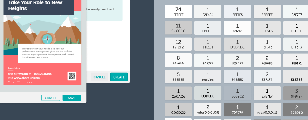
For example, we changed the style of buttons to be bolder and bigger. However, buttons from old features are still using the old style. Another example is colors: we found more than 70 different greys exist in our product, from an audit I did with engineers.
Unmaintainable code
Most of the common UI patterns were done by copying & pasting existing codes to "reuse". After a couple of years of this, it was extremely hard to maintain our codebase. Updating style or behavior would take weeks since it would require engineers to update all existing instances of that component. The engineering team spent a lot of time refactoring, which slowed down our progress.
Starting small
Realizing all these issues, I advocated to establish design guidelines, and eventually a design system within GuideSpark. I researched atomic design and planned to start from the very base of a design system, that would impact every component we would design moving forward.
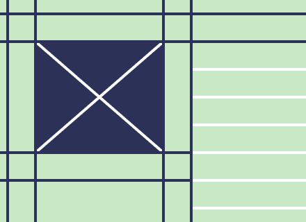
Spacing
I suggested starting using the 8pt grid system in our design and helped other designers make the transition for their on-going works. Our design team adapted the new spacing system pretty quickly, which made it easier to create a consistent experience and rhythm.
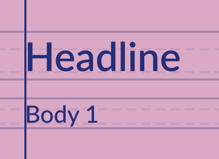
Typography
I set up a Type Scale with multiple options, from headlines to button labels. Thanks for the "Style" feature in Figma, it has simplified our design flow around fonts and helped our design more consistent.
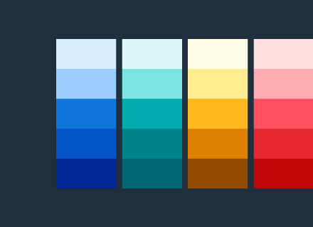
Colors
I listed all the colors we found from our audit, and marked those most common ones. From there, I built up our initial color palette. This included sets of primary color, light and dark greys, secondary colors, and color for warning and critical information.

Iconography
I led a workshop with our design team to explore our icon styles. We concluded three keywords: "delightful", "friendly", and "ease".
After exploring various styles, we decided that icons in GSCC use outline style, with 2px stroke. Icons can also have two different transparency to provide a delightful visual. No sharp angles: every angle has a 3px radius.
Building components
Button
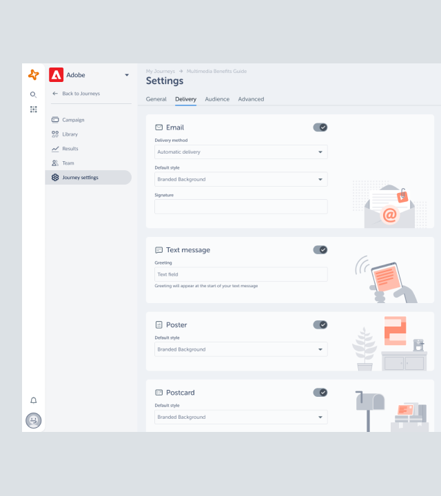
As one of the most common design patterns, Button was the first component we built into our product. By the time we decided to componentize it, our front-end team planned to refactor part their code and built react components to solve their own inconsistency problem. It was good timing since we were working on a feature that involves buttons.
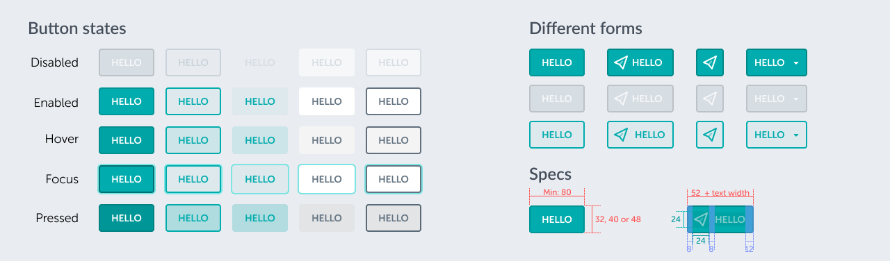
Learn from the best. I studied from a few popular design guidelines, including Material Design, Atlassian Design, and Polaris from Shopify.
After audited all existing buttons, I worked in Figma to build the Button component. I made sure it has a similar look and feel to the rest of our product so it can fit into it and won’t cause obvious visual inconsistency.
It’s hard to get a sense of the transition of each state in a static design file. So I built prototypes with HTML & CSS check and improve the details of each state and the transition between them. This also helped me varify whether the concept was solid and realistic.
After some testing, I published the button component and shared it with other designers. We held component meetings regularly to inform updates and get feedback, so everyone can contribute.
The code was shared with engineers who worked on the React component, so they can easily transfer the visual to React & Sass.
I wrote a design document for the Button component on Confluence, includes the different types of the button and when to use them, behaviors and states, design specs, props, and more.
This document is shared across design, product and engineer teams, so open to comments.
I worked closely with engineers to ensure the implementation of the button component is flexible, aligned to our design component in Figma, and easy to reuse. The engineers and I had a few working sessions so that I could help to spot any visual inaccuracy.
Our engineers loved how easy it is to use this component and that kicked off a good start
Moving forward, we had a few one-off situations that the design didn’t fit our existing component. In those cases, designers tried to see if they could make design changes so we could reuse the component. If not, I would work with engineers to check whether we should incorporate it into our component.
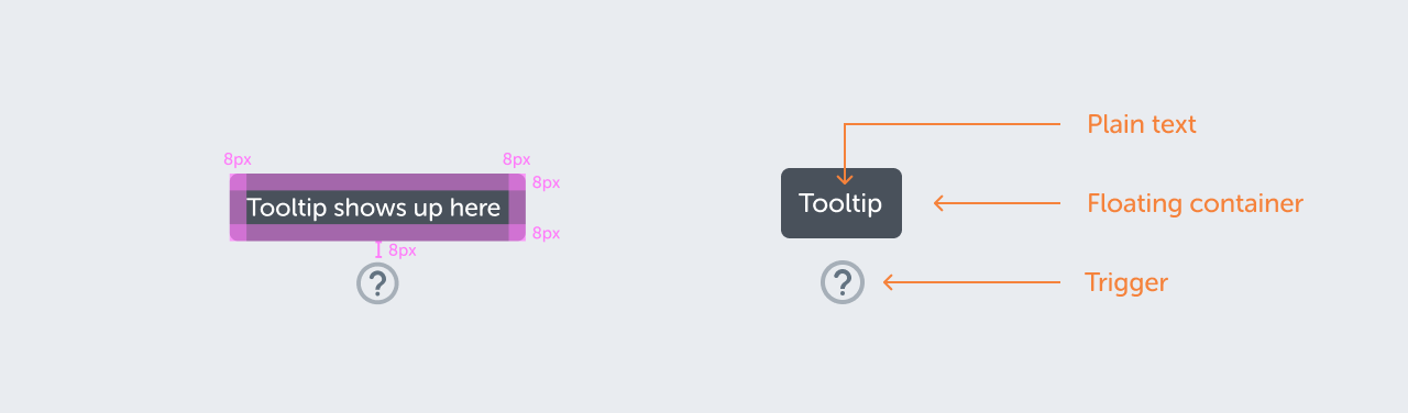
Tooltips
Another example of components we built is tooltips. We started this one was because we only had a couple of tooltips in GSCC so it was very easy to update them to components. I worked on a detailed document for Tooltips as well in Figma and shared it with both teams.
Obstacles
Limited resource
During that time, we had many features in our pipeline so that we could reach our roadmap. Those features are complex and require a lot of resource from our engineering team
Unclear single source of truth
Even though we have built a few components and have provided design guidelines, designers and engineers had a hard time to locating the source. The design guidelines and the code components were not linked together.
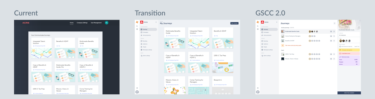
GSCC 2.0 concept
As a new product team formed in 2019, we put more emphasis on componentization and how to make both design and engineer teams more efficient. Due to how small our team was, we didn't have bandwidth dedicated to building out a design system. We made the decision to use Atlaskit as the base of our components, instead of building from scratch. The engineering team embraced the idea and we had a few meetings with them to plan out how we would implement it.
We also decided to slow down the pace of new features. Instead, we gathered feedback from customers and internal users and planned to focus on improving our current functionalities and enabling our customers to fully leverage the GSCC platform.
Componentization had brought to the frontline. As a design team, we agreed to introduce AtlasKit's navigation system to GSCC. I played a critical role in conceptizling how our current features would exist in the new system. I made multiple concepts and presented them to the design and engineering team. Our goal for using components was more than just delivering a consistent experience, we also wanted to make our product more responsive and accessible for our users.
The plan to bring us there
For the new features and the overall structure change, we plan to make wireframes for the engineering team to build up the functionality first. In this phase, we will use AtlasKit components with only the necessary tweaks. Next, we will make UI and UX changes to the components to better suit the needs of our product, and give a fresh look for our brand.
The engineering team created a separate repo for importing and modifying those components. Later on, when the new components are tested, we will merge these new components into the production so the engineering team can leverage the component across teams.
To centralized our documentation for components and design guidelines, I created a new space on Confluence to be our single source of truth for our design system moving forward. Documents for each component are shared in this space and linked to Figma files, AtlasKit pages.
As a team, we began doing a bi-weekly design demo to showcase what we have been working on and what's coming up next for the next few sprints. Communication plays a huge role in making a design system work, and the design demo meeting gave us a chance to present to the whole engineering team to collect feedback and suggestions.
What I have learned
Communication is the key
Communication between design and engineer is important in creating each component. Team members are the real users of a design system.
Having a weekly or bi-weekly round-up meeting to present what has been working on and what's new in the system is an easy way to give people a clear view, also a great opportunity to get feedback. Everyone in the team should be able to contribute.
Design system is iterative
It's nearly impossible to make a design component right in the first round. Testing ideas and gathering feedback from other designers and engineers is crucial in building up a design system.
Design system is empowerment
A design system is not a set of rules, but a tool to empower people to make better design decisions and to build product faster.