Personalized Journey
Case study
GuideSpark Communicate Cloud enables enterprise companies to create communication Journeys to engage their employees in major initiatives, keep employees informed and involved, and drive successful adoptions and alignment. Employers can plan a communication campaign with messages and content experience within a Journey. They can also track the outcomes and get insights from their employees’ behaviors through Journeys.
Most enterprise companies have employees from a wide range of demographics. One of the pain points we got from our customers and CSMs was the lack of effective and efficient when it comes to communicating differently with employees based on their role, location, or other demographics.
Solving this problem would shape the core feature of GSCC to provide more benefits and a better experience. To enable segmentation that lets employers break down their employee population, a single Journey can benefit from using segmentations to configure the messages and formats for different groups of employees. The employees, on the other hand, only see relevant content that is targetted particularly to them.
Type
Case study
Time
Oct, 2018 - May, 2019
Tools
Figma

Problem framing
At the time, one single Journey in Communicate Cloud could only be dedicated to one audience (a defined group of employees). This made planning a Journey for a diverse group of employees very time consuming, and hard to manage.
Our customers either had to duplicate the same Journeys to configure messages to different audiences, or to accept the compromise that their employees would receive irrelevant messages that were not relevant to them..
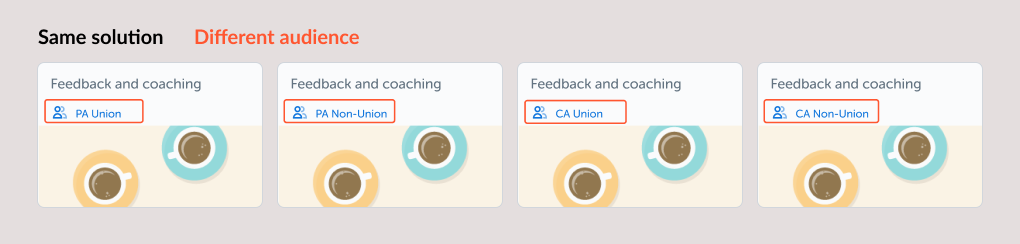
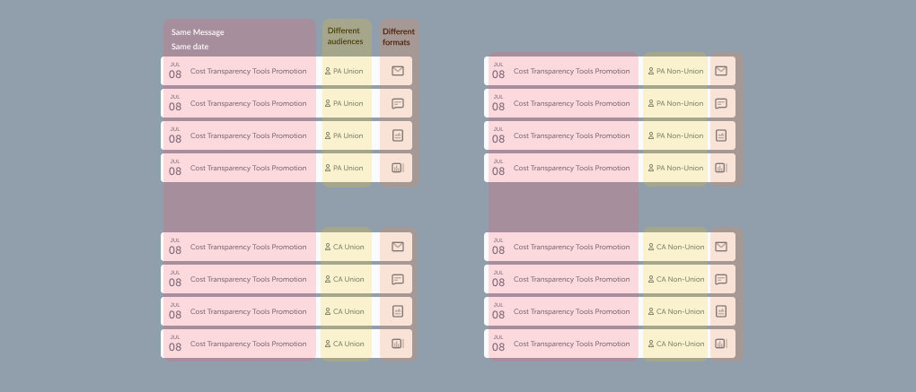
For example, we found one customer who has 4 different audiences they need to reach. They also used 4 different formats (email, poster, text message, and a trackable link) of the message for each audience. To accomplish that, they had to manage 4 Journeys, each for a different audience. Then in each Journey, they created 4 messages for different formats. That in total was 16 variations of the same message.
The goals
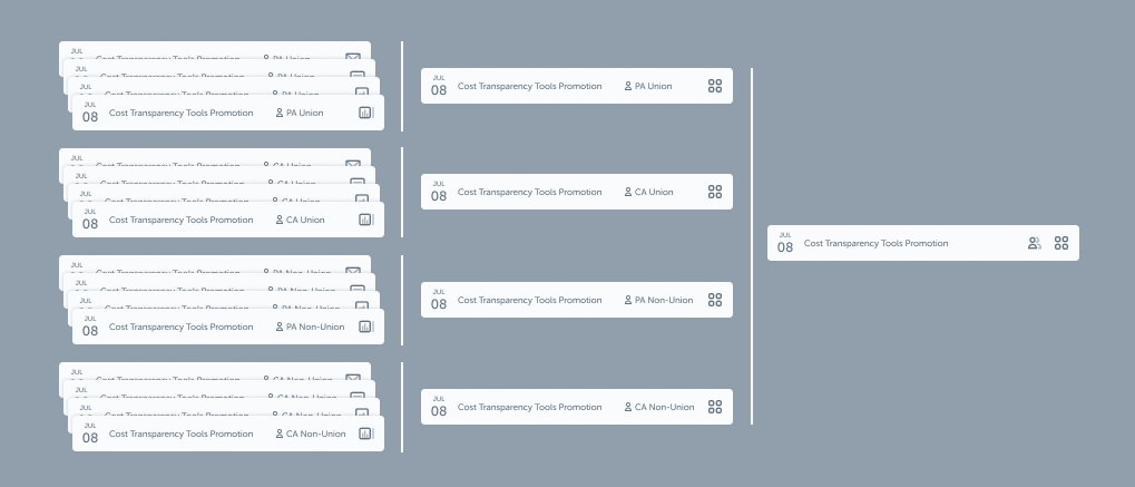
We wanted to simplify the use case mentioned above, so that the user can achieve the goal by only managing one Journey, and has one message in the timeline to contains all the variations.
1. Enable the ability to use one single Journey for the same purpose to reach many different audience segmentations.
2. Allow a Timeline message to have multiple variants with various formats, and deliver to different audience segmentations.
3. Employees, on the other hand, will only receive content related to them. The content could be planned more personal and useful to specific groups, instead of general messages to the whole spectrum of the employees.
Team & My role
I focused on the Timeline and Audience management functions primarily and collaborated closely with two other product designers who worked on Library and Result respectively.
I was heavily involved in defining the problem and shaping it into concepts. My work was from end to end, including early research, define user scenario and workflow, wireframe, UI design, and defined interaction behavior, as well as overseeing and supporting the implementation of the project.
Design process
User interviews & Insights
We conducted one-on-one interviews with our CSMs to better understand what problems our current customers were facing.
From the conversations, I learned that:
- 15% of our customers were duplicating Journeys just to be able to send to different audiences.
- In most of the cases, only a few messages that needed personalization.
- Some customers were duplicating Journeys to be able to track results from different offices.
- Our customers used different formats to reach different groups of employees.
Define use cases and workflows
Designers and product managers as a group identified use cases that needed to cover, and what the ideal workflow is for each case to achieve our goals.
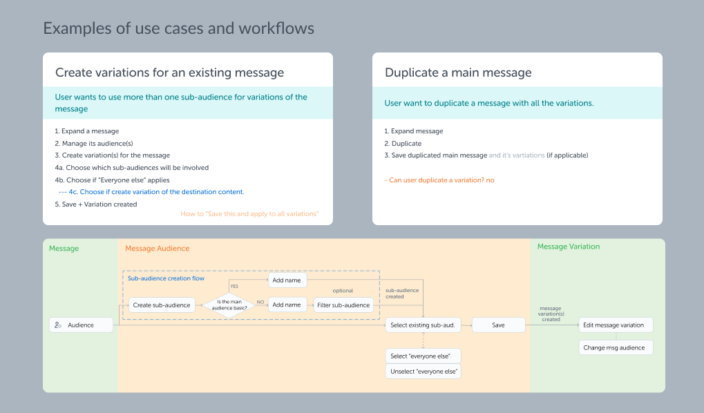
Audit and limit possibilities
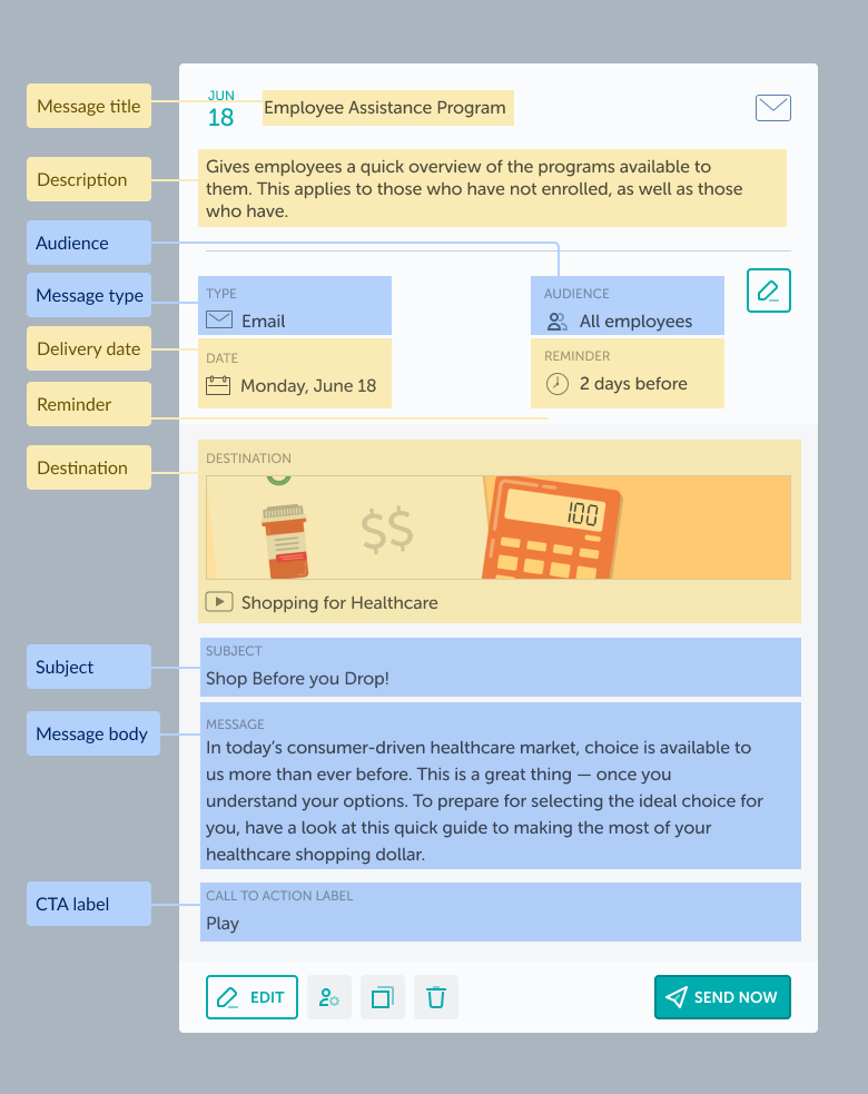
I started auditing the logic behind the existing timeline message. I presented all the information a message contains, and defined what information needed to be shared across all message variations, and what can be set differently.
Shared info: Message title, description, date, reminder, and destination need to be identical for all variations. Otherwise, create different messages would make more sense.
Unique info: Message type, audience, subject, message body, and CTA label can be different for each variation.
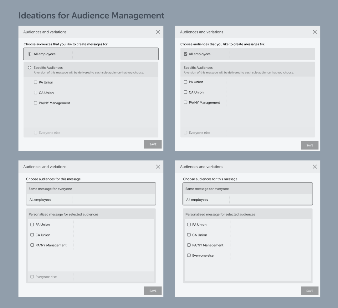
Ideation, Wireframe and Iteration
Once we had a clear view of the project, I started building wireframes for timeline and audience management. Since audience management is a very complex feature, I presented multiple design proposals in our roundup meetings to inspire discussions, and to help us find directions. Then refined and iterated my design from the feedback I gathered with other designers and product managers.
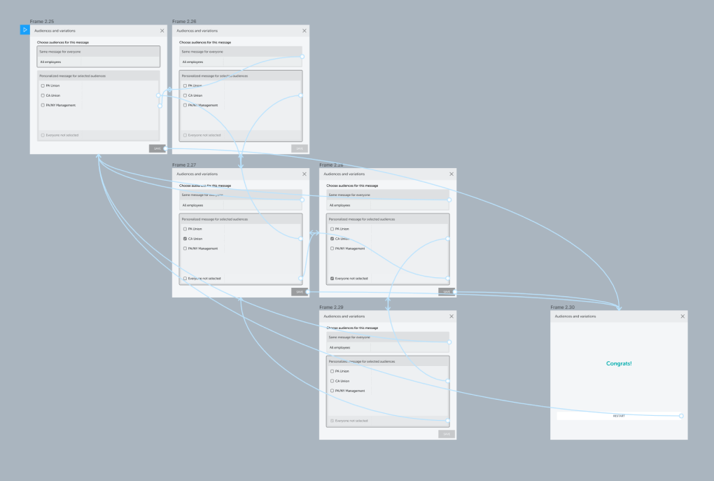
Prototyping and user testing
To test out different ideas, I built simple prototypes to test with our CSMs. Observed how they interact with the prototypes and got feedback from the CSMs was a crucial part of this whole project. It was a quick way to gather very useful user inputs and to verify which design had advantages and how to improve it.
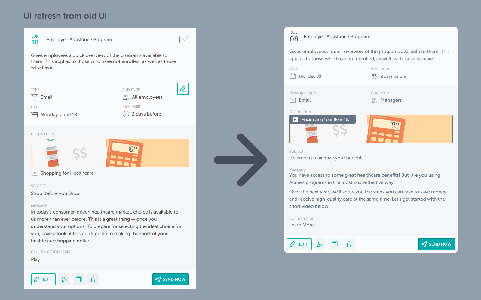
Visual design
I took this opportunity to work on a refreshed UI design for our timeline message. This new design still assembles the look-and-feel of our previous design. However, by tweaking white spaces and applying 8 pt grid spacing, the new design significantly reduced the vertical space an expanded message could take and provided a more consistent visual.
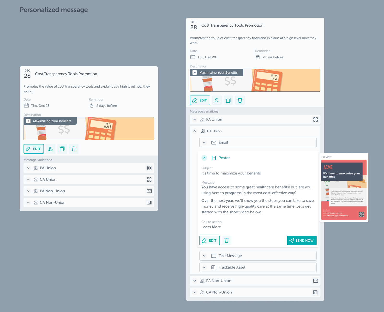
Personalized message UI design. How a message with variations will show in the timeline. (Left: collasped; Right: Expanded)
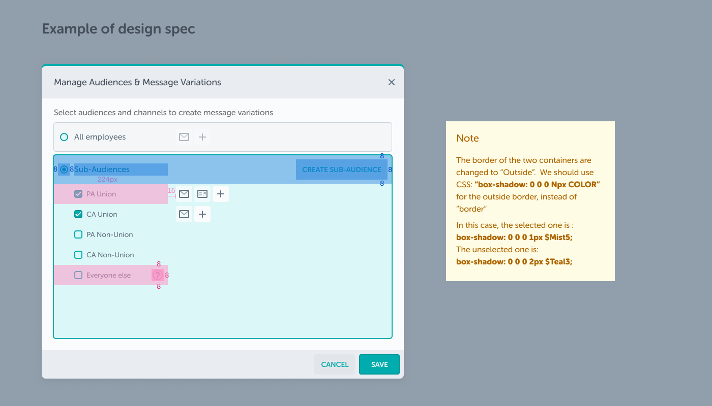
When necessary, I would provide design specs in Figma for engineers. In this example, the pink areas indicate where a sub-audiences option can be (un)selected. It would be harder to communicate this concept without providing a design spec.
I tested out some of my designs in HTML and CSS and left notes to engineers for some tricky CSS situations. In this example, the two option-containers are using outline stroke in Figma, and the selected one has a thicker stroke than the unselected one. In CSS, however, the result of using “border” won’t align with the design and will cause the UI to move around. I did research on how to apply outline strokes in CSS and provided suggestions to use “box-shadow” instead.
I explored various ideas for the icon represents messages that contain multiple reach types.
Partner with engineers
After we kicked off the feature with engineering team, I built hi-fi prototypes in Figma to highlight detailed interactions, motion designs, and the user flow. I worked very closely with our engineers to ensure high-quality implementations.
I worked very closely with our engineers to ensure high-quality implementations. I held working sessions with engineers regularly so that I can provide quick feedback on visual details. This boosted the speed of our development to the final visual.
The outcome
Messages sent in multiple formats had an increased engagement by 10%.
Campaigns that used employee sub-groups increased all three metrics: employees reached, content engagements, and actions taken.
Personalization has become a forefront offering in GuideSpark’s go-to-market strategy.