Google Calendar
Redesign

Type
Individual Acdamic Practice
Time
Jan, 2015 (1 week)
Tools
Photoshop, Paper&Pen, Keynote, After Effects
Too many distractions
In the current Google Calendar website, there are plenty of elements which are not frequently used, or even noticed by users who I interviewed. These elements also occupy a significant amount of spaces which could be wisly used for the calendar per se.
My Redesign
Problems with current design
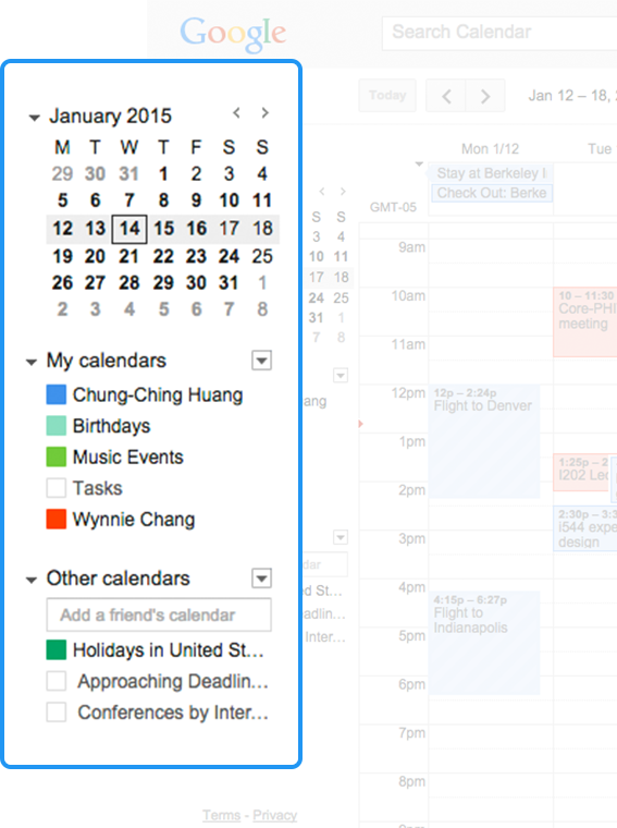
Left Side Bar
Most of the elements in the left side bar of current design are not important features nor used frequently. They do, however, occupy a lot of spaces in this page and may distract users.
Google Calendar users, who I interviewed, merely use the mini-calendar and they don't frequently toggle nor edit their different calendars.
Base on Horizontal Attention Leans Left, People spent more than twice as much time looking at the left side of the page as they did the right.
Control Bar
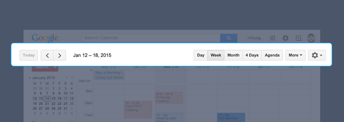
The Control Bar is more frequently-used than the features in Left Side bar. Such as switching between week view and month view, or jumping to next week/month, etc.
However, when users focusing on calendar, their mouse pointer, most of time, are hovering around the middle of the calendar area. In this case, The control bar is seems a little bit far away and not very easy to reach.
My rationals
Minimize distractions
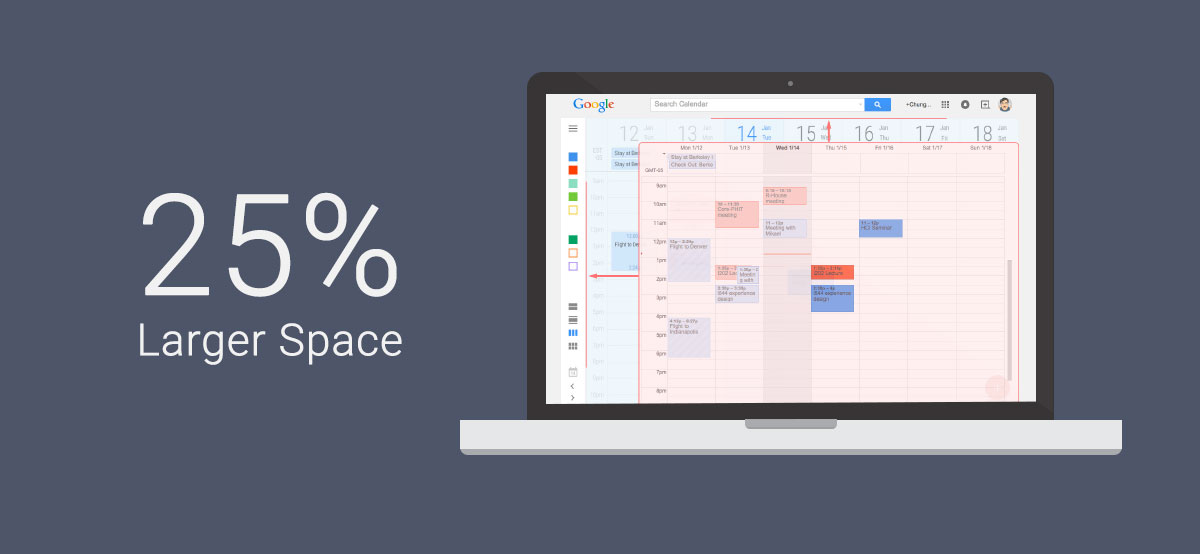
I shrunk the size of side bar, so it’ll be more spaces for the calendar per se and less distractions than current design.
The mini calendar and the names of each calendar are hidden in Sidebar. Users can still click on the Hamburger icon to expand the sidebar to see them.
As most of calendars are created by users themselves and because they using them a lot to create different events, the colors of each calendar should be enough for them to recall. Beside, users can still toggle each calendars without expand the side bar by click the colored squares, which present different calendars.
I also moved most of the functions in Control bar into left sidebar to release more spaces for calendar and also to reduce the length users have to move their pointer to reach these buttons.
Maximum Calendar
Enlarged Date. It’ll be easier for users to distinguish. It’s big enough so they could just glance it to tell what is the date.
Almost a full-screen of calendar view. In this way, it has abundant spaces to show more events and their details. Also, less distractions in this screen, so users can focus on their main task more effortless.
Moving the Create button here to follow Google’s new design guide.
More Details of Events
With decent height
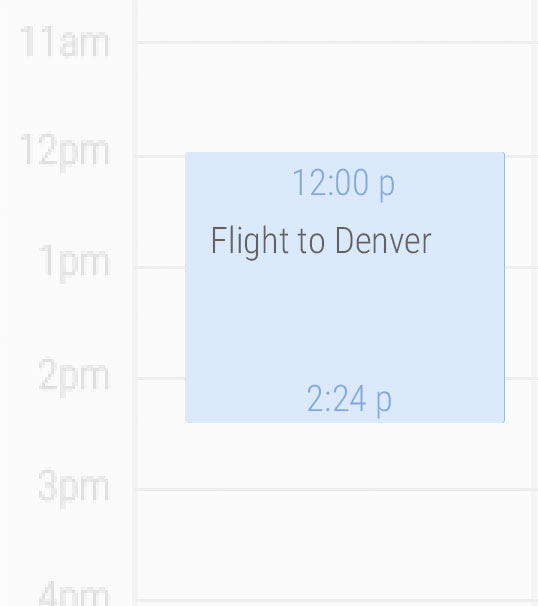
Events which have enough space to show up their information will be presented like this. Beginning and ending time are located at the top and bottom area to indicated the time information about the event.
Shorter duration events
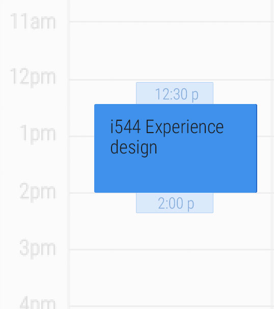
The space of events with shorter duration is very significant. It’d better to show more details of it, because the detail of an event is the key for users to realize them.
As the space is very precious, beginning and ending time are put into an extended area.
What if events are overlapped...
Moving mouse to hover on an overlapped event will lift it up to the front.
In this way, events which are sharing a mutual period of time do not need to sacrifice a lot of their width.

