Candidates Cabana
Type
Individual Design
Time
Jun - Aug, 2015
Tools
Sketch, Paper&Pen, Keynote, Invision, Pixate
Project Pitch
At the first beginning of my internship, I had to find a topic for my individual design project for Idean. I talked with a bunch of people and found some interesting topics that worth to work on. One thing that I very interested in is the tool our recruiters used to collecting candidates’ information during events, like university tours. I used it during our HCI/d-Connect event and the app was quite simple and may confuse candidates when they try to input their information. The recruiters hope their app can be more intuitive for them and for candidates. And at the mean time, they also think it could be a wonderful opportunity to give a great impression to candidates who are interested in Idean.
My Design
Getting started
Interview with users
From the first interview with the users: our recruiters Pirkka and Sheila, I got to know which tools they were using to manage candidates, what it can and cannot do, what is their hiring process, etc. Plus, what the pain points for them to use the current collecting app while attending a recruiting event. There are three important points that I got from this interview: the app should be able to help them remembering candidates, easy to scan information and provide a good branding.
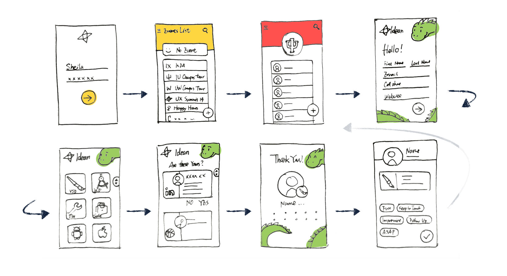
I brainstormed plenty of ideas after the first interview and sketched them out before I validated them with our recruiters. Here are several initial ideas based on these points:

Easy to recall
Profile pictures, fetch data from LinkedIn, Tags
Glanceable candidates list
Group by events, easy to scan information
Good branding
Focus on candidate side for branding; Intuitive form, less required input, good visual.
Ideas Validation
After generated ideas and sketched them out, I talked with our recruiters again to make validation. As I talked with Pirkka and Sheila, I got more details about those recruiting events and how the app can helps them. One example is that I knew they usually meet more than a hundred candidates during a big recruiting event and even profile pictures may not help them to remember who is whom when they got back. However, both of them agreed that tags could be helpful. My initial thought about tags for candidates are customizable and have a lot of options. But after talking with them, I knew what they really need is just a few important tags, such as: Follow up, Ignore, etc. They hope they could still have natural conversation with candidate with the app. So, the simpler the better.

Design and Iteration
Design Base On The Storyboard
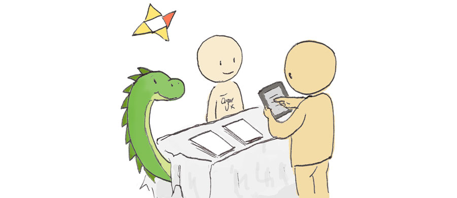
We use a few iPads to collect information during events and the app involves two kinds of users: our recruiters and candidates. So, one thing that I decided is two parts of the design could use different design principle.
On the recruiter side, the most crucial thing is to make it easy to learn, quick and natural when use and support remembering. I did several sketches try to support these points.I kept talking with our recruiters with my concepts and during that time I found it is necessary and extremely helpful to keep checking with your end users with your ideas and designs.
On the candidate side, I believe an intuitive and non-confusing design would be a good way to branding Idean as a design agency. Plus, a well designed visual appearance would be nice too.
Wireframing and Iteration
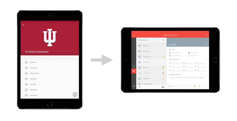
After I showed my first wireframe to our designers, I got a lot of feedbacks from them. Since it was my first time to design a tablet app, I initially designed it in portrait view. Some of our designers suggested I should change the app into landscape view. From my experience with some tablet apps, landscape mode is more convenient to use, especially apps like Gmail, Contacts, which the main purpose of them are scanning data. So I iterated on my design. I also did a survey about how people use their tablet to see whether people prefer using tablet in a specific mode, or it depends on what kind app they are using. The result leaned to the later one. Thus, I decided to make candidate parts work with both view.
A lot of details changed as I iterating my concepts and communicating with our recruiters and other designers. I learned that sketch is good for exploring ideas, but wireframe them down really helping me to find those details I missed or should be improved.

Final Design and Hand Off
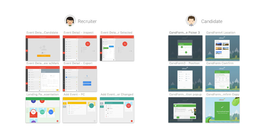
Prototyping and Final Design
Base on my wireframes, I made an Invision prototype so I could easily go through all the processes and test it with others. Design can never be perfect, and I did get more details that could be improved after testing with our recruiters and other co-workers in Idean. However, design has to end at some point, or it will alway be a imperfect concept rather than something useful. I iterated my design one more time to tweak details at the end of my internship and started to prepare the final presentation and annotations about my project.
